Turn Visitors Into Loyal Customers With a Seamless Experience
Imagine this: someone lands on your website… but within seconds, they click away. Why? Not because your product isn’t great — but because your website feels confusing, slow, or clunky.
In 2025, your website isn’t just a digital brochure — it’s your salesperson, brand rep, and customer service desk all rolled into one. And if it’s not user-friendly, you’re leaving leads and revenue on the table.
Let’s fix that. 🚀
Here are 5 proven ways to make your website more user-friendly — and keep your visitors coming back for more.

1. Make Navigation Effortless
If users have to search for it, they’ll leave.
Your website should guide visitors like GPS — not a maze. The easier it is for people to find what they’re looking for, the more likely they are to stay, click, and convert.
- Keep menus short and clear
- Use logical categories and dropdowns
- Add a visible search bar for large sites
- Always include a clear CTA on every page
Less confusion = more conversions.
2. Be Obsessed With Mobile Experience
60%+ of users browse on mobile. What does your site look like on a phone?
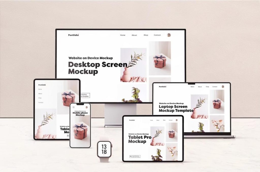
Mobile-friendly isn’t optional anymore. A modern user-friendly website must look great and work perfectly on every device.
- Use a responsive design that adapts to screen sizes
- Keep buttons thumb-friendly and links spaced out
- Avoid intrusive popups that cover the content
Pro Tip: Google also ranks mobile-friendly sites higher in search results.
3. Supercharge Your Page Speed
Every second your site takes to load, you lose visitors.
People are impatient — and so is Google. A slow website feels outdated and untrustworthy. Keep things lightning-fast for a smoother experience.
- Compressing large images (use WebP)
- Removing unused plugins and scripts
- Choosing high-performance hosting
- Enabling caching and lazy loading
Fast websites = better UX + higher SEO + more sales.
4. Use Clear, Powerful CTAs
Guide users — don’t leave them hanging.
You’ve got their attention — now tell them exactly what to do. A great CTA (Call-to-Action) should pop visually and drive immediate action.
- Use action words like “Start Now” or “Get a Free Quote”
- Make your buttons big, bold, and visible
- Match CTA placement to user intent (top, middle, bottom of page)
A confused user never converts. Clarity is key.
5. Keep Your Content Ridiculously Readable
Write for humans, not robots.
Users skim before they read. If your content looks like a wall of text — they’re gone. Keep your copy light, friendly, and easy to digest.
- Use short sentences and paragraphs
- Break up text with headers and bullets
- Highlight important points in bold
- Write like you talk — keep it conversational
Readable content builds trust and keeps people scrolling.
Final Words: Great UX = More Growth
You don’t need a complete redesign to create a more user-friendly website. Start with these small changes — better navigation, faster pages, clear CTAs, and mobile-optimized layouts — and you’ll see big results.
- More engagement
- Lower bounce rate
- Higher conversions
Need help building a website your users will love?
At Eron Techno Solutions, we specialize in creating websites that are fast, responsive, and conversion-focused. Whether you’re launching new or upgrading old — we’ll help you turn your site into a true business asset.
